Responsive Website Design Services in Bangalore
- More Mobile Traffic
- Faster Mobile Development at Lower Costs
- Lower Bounce Rates
- Higher Conversion Rates
- Improved SEO
- Improved Online Browsing Experience
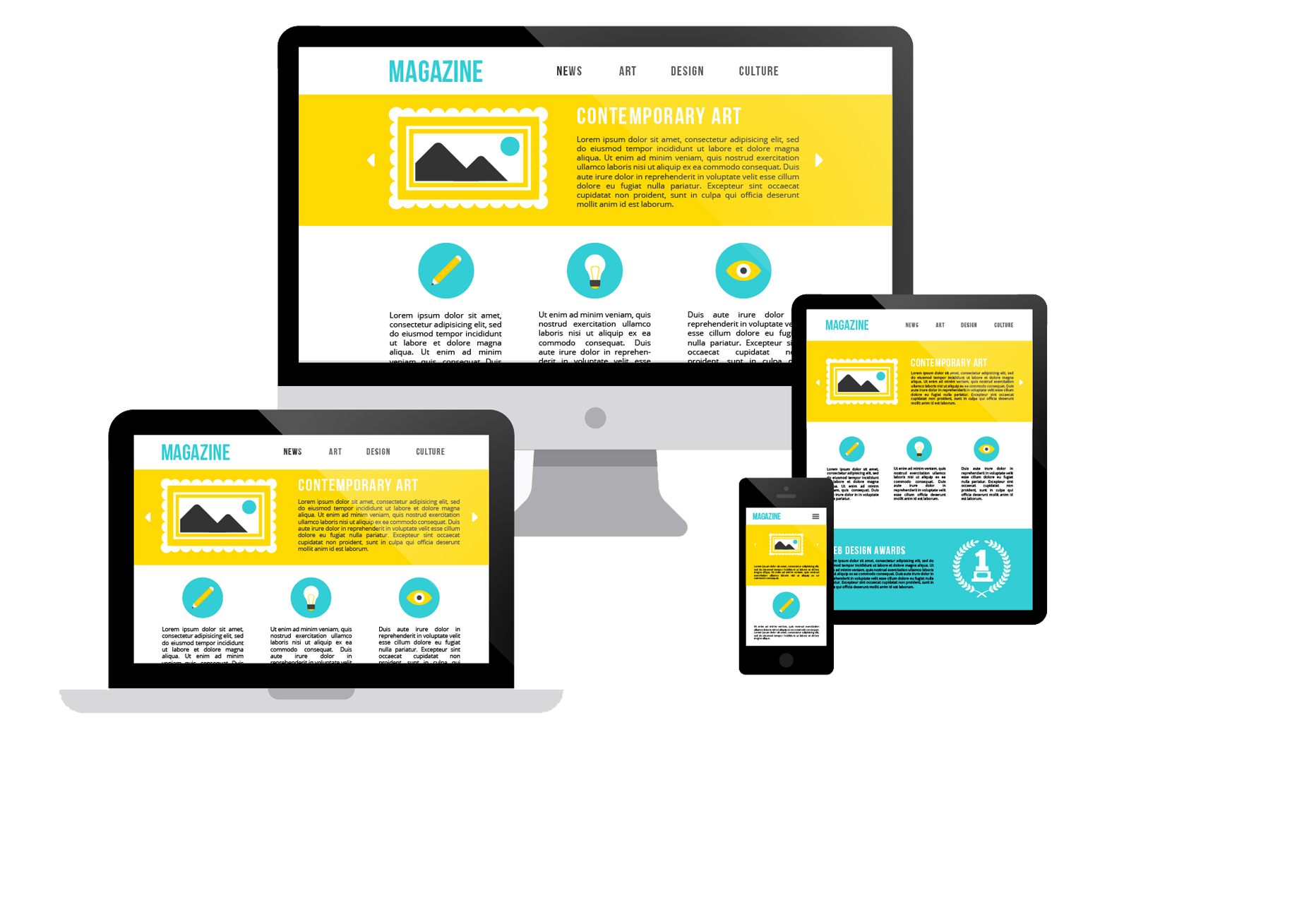
Webzindagi technologies responsive web design (RWD) is an method or concept to design websites that makes web pages render well on devices of different sizes.
Responsive Website Design Services that Improve the Website Viewing Experience
The web world today isn't simply constrained to desktop or PC. Individuals like to perform multiple tasks and do their web perusing on cell phones that they can bear with them. In such a situation it is imperative that your website capacities similarly as easily on mobile devices as on PCs. Furthermore, the best approach to guarantee a smooth similarity from device to device is responsive web design service in Bangalore.
You never know from which device the user would prefer to visit your website so your website must give solid access to them from all device, a responsive design remove every one of your stresses over its looks on changed devices as it fits on devices including work areas (desktop), all screens sizes of mobiles, tablets and so on. Having responsive plans likewise spare your time, endeavors and cash as there is no compelling reason to build creative website design for various platforms.
How Does Responsive Web Design Work?
Responsive website design aspect the layout to the viewing environment by using fluid grids, flexible images and css3 media queries an extension of the @media rule, in the following ways.
Why You Need to Switch to Responsive Web Design
Due to the high volume of usage of internet on mobile devices they can no longer be ignored. In 2014, for the first time more users accessed the internet from their mobile devices (In your Google Analytics, select "Audience" on the left side, then "Mobile" to see what proportion of traffic is from mobile devices. You can even drill down to see which devices are sending the traffic.) than desktop.